MML3 Reaverbot Event Honorable Mentions
In addition to the winner of the Mega Man Legends 3 Devroom's Reaverbot Event, Art Director Ishihara also gave honorable mention and commentary on a number of entries. Beyond these, even more entries received comments from particular divisions of the game's staff.
Runner Up & Honorable Mentions

Dantragoty
Submitted By Kobun #1221Comments from Art Director Ishihara:
Above all else, it was the unique and interesting way in which this creature moves that caused us to select it. This submission showed a thorough understanding of its own core concept, even extending that concept into its attacking methods. It may not look particularly unique at first glance, but I bet there would've been a lot of surprised faces once people saw this thing move.
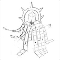
Tailee Taboz
Submitted By Kobun #5349Comments from Art Director Ishihara:
There were a number of submissions where the Reaverbot was disguised as a background piece, but this one presented both a very clear attack strategy and a fascinating shape-shifting element, so in my mind, this was the best of that sort of submission (not that a submission has to have a clear attack strategy; for some submissions, the fun was in the idea of players wracking their brain trying to figure out what to do).

Buruguruhan
Submitted By Kobun #4341Comments from Art Director Ishihara:
The attack patterns and strategy were very well compiled and would be great for the game. I also love how there's a significance to the number of bones in its neck.* I just thought its hook and general explanation could've used a little more polish. So close!
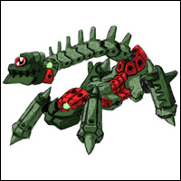
Janusbot
Submitted By BorisComments from Art Director Ishihara:
Simply put, this is so cool!!

GaiNeeRope
Submitted By Invader DanComments from Art Director Ishihara:
Here I thought it was going to use the rope to strangle you, and it turned out to be more of a jump-rope affair! The humiliation of being forced to jump rope mixed with the creepiness of the design does strike me as somehow fitting for this series. . . .
Motion Awards
The motion staff is mostly responsible for creating characters' movements. Especially when it comes to player characters, which are in essence extensions of the players' bodies, it's important to make sure actions such as pulling levers and pushing buttons all feel natural for the player, so lots of little adjustments are made again and again. It's a very important job.
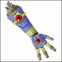
Katado Tehan
Submitted By Kobun #294Staff Comments:
It would be interesting if the hands' fingers could move around to create various expressions. Not only was the general design of this entry good, but also its various attack pattern ideas.

Smearcian
Submitted By BrianStaff Comments:
Very cool design along with very cool movements. I can envision an agile, formidable Reaverbot with geometrical attack patterns.
Effects Awards
It mostly entails creating and adding visual effects in order to help convey what's happening in the game. Hit marks and explosions are both examples.
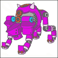
Gachilas
Submitted By Kobun #5589Staff Comments:
I think this would make for a very loud battle. I also like the gas self-destruct feature.
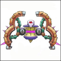
Go-Gogant
Submitted By Wyvern-SmasherStaff Comments:
The array of attacks made possible by its many forms is simply incredible.
Scroll Awards
The term "scroll" comes from the old days of side-scrollers, but nowadays is used just to refer to game backgrounds. Huh. I wonder if only Capcom does that. Heh. At any rate, that means we deal with everything in the game except for characters and the effects applied to them. That includes buildings and houses, mountains and the sky, various backdrops, and each and every blade of grass you see. As you can imagine, this is a big part of the process of creating the game's look and feel, so we put a lot of work into creating a beautiful, fun place for our characters to roam. We hope you'll thoroughly enjoy the look and feel of this game.

Forbo Oll
Submitted By Kobun #4407Staff Comments:
It was this submission's form, the lamppost motif*, that won us over. We can imagine it blending in perfectly with its surroundings, and if that doesn't deserve an award from the background staff, what does?!

Kaetoriizu
Submitted By RaijinStaff Comments:
Again we have a design that blends in with its surroundings perfectly, this one acting as a trap that imitates a dungeon room. We really wanted to see this battle go down, with the Reaverbot taking advantage of people's greed and then mocking them as it chomped down.
Model Awards
Modeling consists of creating the polygonal character and enemy models and their textures. We spend the majority of our lives figuring out how to create the best-looking models and textures we can using limited numbers of polygons. I might add that the limited disk or cartridge space means sometimes having to vie for space with people working the above sections. It's a fun job, but there's nothing quite as depressing as putting your all into something only to discover that you've run out of disk space and won't be able to implement it.
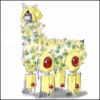
Al Paca
Submitted By Kobun #163Staff Comments:
We fell in love with this design, which is fun on the surface, but also rather scary upon close inspection. The eyes of countless Zakobons gleaming in the darkness. . . . The player would grow weary and cautious, only to reveal. . . . an alpaca-bot?! So cute! And yet, fierce. It's this kind of juxtaposition that grabs people.
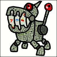
Automata
Submitted By KennyStaff Comments:
I think I'd get so hung up on trying to score cool loot from this thing that I'd forget all about fighting it! If more than one appeared at a time, you'd have even better chances of getting something good, and you'd probably end up wasting a lot of time. Sounds fun!
I do think that in its current state, it'd be a bit hard to make out the symbols from far away, so you'd probably have to make it considerably bigger.
Ishihara Awards

Roh Fuu Hai Roh
Submitted By Kobun #5973Comments from Art Director Ishihara:
This one was sort of a long shot (no offense), but I was impressed by the playfulness and uniqueness of it, with its drain plug for an eye and its "hot water" markings.
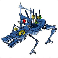
Galvazalba
Submitted By Kobun #647Comments from Art Director Ishihara:
A Reaverbot from Hell. This one simply exudes evil. The poor, skewered Zakobons really grab one's attention.
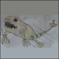
Licker
Submitted By 家毅Comments from Art Director Ishihara:
Normally having so many different attacks weakens the design's impression, but I enjoyed imagining this thing unleashing one attack after the next, making MegaMan's life miserable. I can tell you had a lot of fun drawing and creating this.
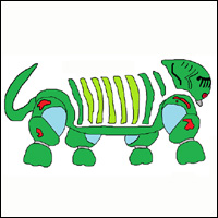
DiZeBoko
Submitted By PurifierComments from Art Director Ishihara:
Though there were plenty of Reaverbot ideas with protected weak points, this was the first time I'd ever seen one with a rotating ribcage. Reaverbots never were much for efficiency.

![[External]](styles/exlink.gif)


