MML3 Reaverbot Event
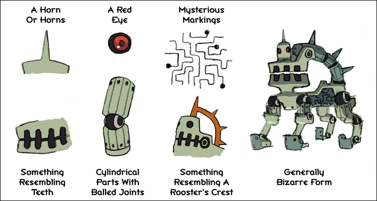
Mega Man Legends 3's fourth Devroom event ran from 2011/01/19 to 2011/02/01, and asked participants to come up with new reaverbot designs for the game. The stated criteria was remarkably vague, asking for a four-legged design and leaving all other aspects of the design up to the imagination, including the setting. Art Director Ishihara-san did give some pointers, and also provided a reference image highlighting the key elements of reaverbot design.
 The Capcom judges chose a number of honorable mentions, but were looking for only one official winner from the many entries they received.
Comments from Art Director Ishihara:
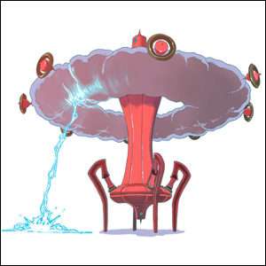
"Beautiful in its simplicity and lack of erroneous accoutrements, with a dash of forebodingness, this was a very attractive submission. It also has great potential for expansion; I can imagine the cloud taking on different forms and such. I also think the addition of those mechanical pieces around the cloud add a bit of realism--they look like they're generating the cloud, rather than having the cloud just float there inexplicably. A very astute accent."
Click to see how the devs refined Calamity's design
-It ought to have the kind of initial impact that makes players freak out when they see it for the first time: "What the crap?!"
-It's good to have some kind of twist or gimmick in its design or structure. Something to make it look a little bizarre.
-Even if you're going for a scary or "cool" design, it ought to have a dash of loveableness thrown in.
-It should have some kind of marking or pattern to give it sort of an "ancient" vibe.
That's probably a good start. I'd have to hire an assistant if I wanted to cramalam all my advice into this one post, but this should give you some good reference. But ultimately, just be free and have fun with it!

 The Capcom judges chose a number of honorable mentions, but were looking for only one official winner from the many entries they received.
Calamity, by kankan
Comments from Art Director Ishihara:
"Beautiful in its simplicity and lack of erroneous accoutrements, with a dash of forebodingness, this was a very attractive submission. It also has great potential for expansion; I can imagine the cloud taking on different forms and such. I also think the addition of those mechanical pieces around the cloud add a bit of realism--they look like they're generating the cloud, rather than having the cloud just float there inexplicably. A very astute accent."
Click to see how the devs refined Calamity's design

![[External]](styles/exlink.gif)


